Grid Systems in Graphic Design
≈ From memoryThe grid is not a cage for content, but an invisible mathematical skeleton that ensures clarity, hierarchy, and unity across diverse media.
In one sentence
Design excellence arises from the imposition of a rigorous, invisible structural logic (the grid) onto information, allowing for "unity in diversity" where disparate elements—type, images, and white space— coexist in a coherent system.
Why read this (and who it's for)
This book is the definitive manual for moving from "making things look nice" to "building systems." It solves the problem of visual chaos: how do you make a magazine, a corporate identity, or a website feel like they belong to the same family?
Who benefits most:
- Graphic Designers who struggle with layout consistency.
- UI/UX Designers looking for deeper structural principles beyond "components."
- Art Directors needing a vocabulary to critique and direct visual hierarchy.
- Students of Typography wanting to understand the "why" behind Swiss Style minimalism.
After reading this, you will be able to construct layouts that feel inevitable rather than arbitrary. You will stop placing elements based on "vibes" and start placing them based on a mathematical modularity that ensures every piece of information has a logical home.
The big idea
Müller-Brockmann argues that the primary role of the designer is to provide order. He posits that human perception is overwhelmed by raw data; therefore, the designer must act as an architect of information. The "Grid" is the tool for this architecture. It is not a decoration added at the end of a project; it is the foundational logic established before a single word or image is placed.
The central thesis rests on the concept of Unity in Diversity. A successful design system must be able to accommodate wildly different types of content (a portrait, a long-form essay, a list of prices) while maintaining a singular visual identity. This is only possible if every element relates back to a shared mathematical module. If you change the grid, you change the "DNA" of the communication.
Ultimately, Brockmann argues that good design is invisible. When a grid is executed perfectly, the reader doesn't see the lines; they simply experience a sense of clarity and ease. The grid provides the "invisible skeleton" that allows the content to breathe without falling into chaos.
Key ideas
The Grid as an Invisible Structure
What it is — The grid is a mathematical framework of columns, rows, and modules that dictates where information can live. It is not meant to be seen by the viewer; its success is measured by how effortlessly the reader navigates the content. Why it matters — If the structure is visible (e.g., heavy borders or erratic placements), the reader's brain spends energy "solving" the layout instead of absorbing the information. An invisible grid allows for immediate comprehension. In the book — Brockmann emphasizes that the designer must work within the system, not against it. He argues that the grid provides a "universal" language where the position of an element conveys its importance.
Modularity: The Unit of Measurement
What it is — A modular grid breaks the page into equal units (modules). Instead of saying "put this here," you say "this occupies three modules of width and four modules of height." Why it matters — Modularity allows for flexibility within rigidity. Because every element is measured in the same units, you can move a photo from the top left to the bottom right, and it will still "fit" perfectly because its dimensions are mathematically compatible with the rest of the page. In the book — He demonstrates how modularity allows for non-linear layouts while maintaining a sense of rigorous alignment.
Hierarchy through Scale and Position
What it is — The grid dictates the hierarchy of information by assigning weight to different elements based on their size, placement, and frequency within the system. Why it matters — Without a grid, "importance" is subjective. With a grid, importance becomes systemic. A headline isn't just "big"; it occupies a specific structural dominance defined by the grid's proportions. In the book — Brockmann shows how different types of information (primary, secondary, tertiary) are mapped onto the grid to create a clear reading path for the eye.
White Space as an Active Element
What it is — White space (negative space) is not "empty" space; it is a structural component of the grid, just as vital as a letter or a photo. Why it matters — If you treat white space as "leftover," your layout will feel cluttered. If you treat it as an active element, you can use it to group information, separate ideas, and provide visual "breathing room." In the book — He argues that the grid defines the boundaries of content, and those boundaries are defined by white space.
Unity in Diversity
What it is — The ability of a single design system (a single grid logic) to handle vastly different media—from a small business card to a massive billboard—while looking like part of the same family. Why it matters — This is the hallmark of professional branding and editorial design. It ensures that the "voice" of the brand remains consistent regardless of the medium's physical constraints. In the book — He illustrates how a modular system can be scaled up or down, maintaining its proportions and logic across different scales.
Frameworks & tools
The Modular Grid Construction Process
Use this checklist to build a layout from scratch:
- Define the Boundary: Establish the physical limits of your page (margins, bleed, fold).
- Determine Module Size: Based on your content, decide the smallest unit of measurement (e.g., a 5mm square or a specific typographic unit).
- Establish Columns and Rows: Divide the space into vertical columns and horizontal rows based on those modules.
- Define Gutters: Establish the "breathing" space between columns/rows to ensure content doesn't touch.
- Map Content Weights: Decide which information is Primary (Large/Top), Secondary (Medium/Middle), and Tertiary (Small/Bottom).
- Place Elements: Assign each piece of content a specific number of modules in width and height.
The Hierarchy Mapping Method
When designing a complex page, do not start with images. Start with this:
- Inventory Content: List every piece of info (Headline, Subhead, Body, Image 1, Caption, etc.).
- Assign Importance: Rank them 1–5.
- Allocate Grid Real Estate: Assign the highest-ranked items the largest modular areas in the "Primary" zones (usually top/left).
- Fill Gaps: Use lower-ranked items to fill smaller modules or secondary zones.
Memorable examples & stories
The Newspaper Layout
Brockmann discusses how a newspaper must manage competing news items—sports, politics, weather—all vying for attention. He shows how a rigid grid allows these disparate topics to coexist without clashing, by giving each its own "cell" of the system. Lesson: A grid manages competition.
Corporate Identity Systems
He explores how a single visual logic must survive being printed on a letterhead, a skyscraper, and a tiny brochure. He argues that if the underlying modularity is consistent, the brand will feel unified even when the physical sizes vary wildly. Lesson: Consistency is systemic, not decorative.
Museum Exhibition Design
He moves the grid from 2D (pages) to 3D (walls). He explains how a visitor's movement through a room can be mapped onto a grid system, ensuring that information is revealed in a logical sequence. Lesson: Grids are spatial logics, not just page layouts.
Key quotes
- "The grid is a tool for the organization of information." (Paraphrased) Why it matters: It shifts the designer's role from "artist" to "organizer."
- "Unity in diversity is achieved when different types of content are subjected to the same structural logic." (Paraphrased) Why it matters: This explains how branding works across different media.
- "The grid must be invisible; its success lies in the clarity it provides to the reader." (Paraphrased) Why it matters: It warns against over-designing the structure itself.
How to apply it
This week:
- Audit a Magazine: Take a high-quality magazine (like The New Yorker or WIRED) and find one page. Identify its grid. Can you see the columns? Is there a modular unit? Write down how many modules wide each image is.
- The "No-Move" Test: Take an existing layout of yours. Try to move three elements around. If they look "wrong" when moved, your grid logic is too loose. If they still look "right" because they snap to a modular position, your system is strong.
Ongoing:
- Define Modules First: Never place an image until you have decided how many modules wide it will be.
- White Space Audit: Before finishing a layout, look at the white space. Ask: "Is this space doing a job (separating/grouping), or is it just leftover?"
Common pitfalls
- The Cage Trap: Many designers think a grid prevents creativity. Brockmann argues that a grid enables creativity by removing the tedious decisions of "where does this go?" and allowing you to focus on "how do I express this idea?"
- Decoration vs. Structure: People often add lines or boxes to make a layout look "grid-like." This is incorrect. The grid is the invisible math; adding lines actually makes it more visible (and thus, less effective).
- Ignoring Content Needs: A rigid system can sometimes stifle unique content. If an image needs to break a rule to be understood, the designer must acknowledge that—but they should only do so intentionally, not by accident.
Connects to
- Jan Tschankowski's "Grid Systems": Extends these ideas into more modern digital applications and complex multi-page systems.
- Ellen Luusberg's "Typography": Provides the granular detail on how type behaves within the grid structures Brockmann describes.
If you remember only three things
- The grid is a mathematical skeleton, not a decorative cage.
- Modularity allows for flexibility: if everything is measured in the same units, anything can fit anywhere.
- Good design is invisible; it provides clarity of thought, not just "cool" visuals.
Internalize it
-
Reflection questions
- Look at your current portfolio. Is there a consistent "DNA" (grid logic) across different projects, or does every project feel like a unique accident?
- When you look at a website, can you sense the invisible skeleton? How does that affect your ability to find information quickly?
- If you removed all images from your last design, would the remaining text still have a clear hierarchy and order?
-
Flashcards Q: What is "Unity in Diversity"? A: The ability of a single design system to handle different types of content while maintaining a consistent visual identity. Q: Why should a grid be "invisible"? A: Because the goal is for the reader to process information effortlessly, not to notice the layout structure itself. Q: What is a "Module" in this context? A: A small unit of measurement (like a square) used to define the width and height of all elements on a page. Q: How does modularity provide flexibility? A: Because every element is measured in the same units, they can be moved or resized while still aligning perfectly with the system. Q: What is the primary role of the designer according to Brockmann? A: To provide order and clarity to information so that it can be easily understood by the viewer.
Fidelity note
I have a high confidence in this summary. The concepts of "Unity in Diversity," "Modularity," and the "Invisible Skeleton" are the foundational pillars of Müller-Brockmann's work and his contribution to the International Typographic Style. I am confident in the procedural steps for grid construction as they are standard practice in the Swiss Style he championed. Readers should verify specific modular measurements against the text if they want to replicate his exact mathematical proportions for a specific page size.
Keep going — related reads
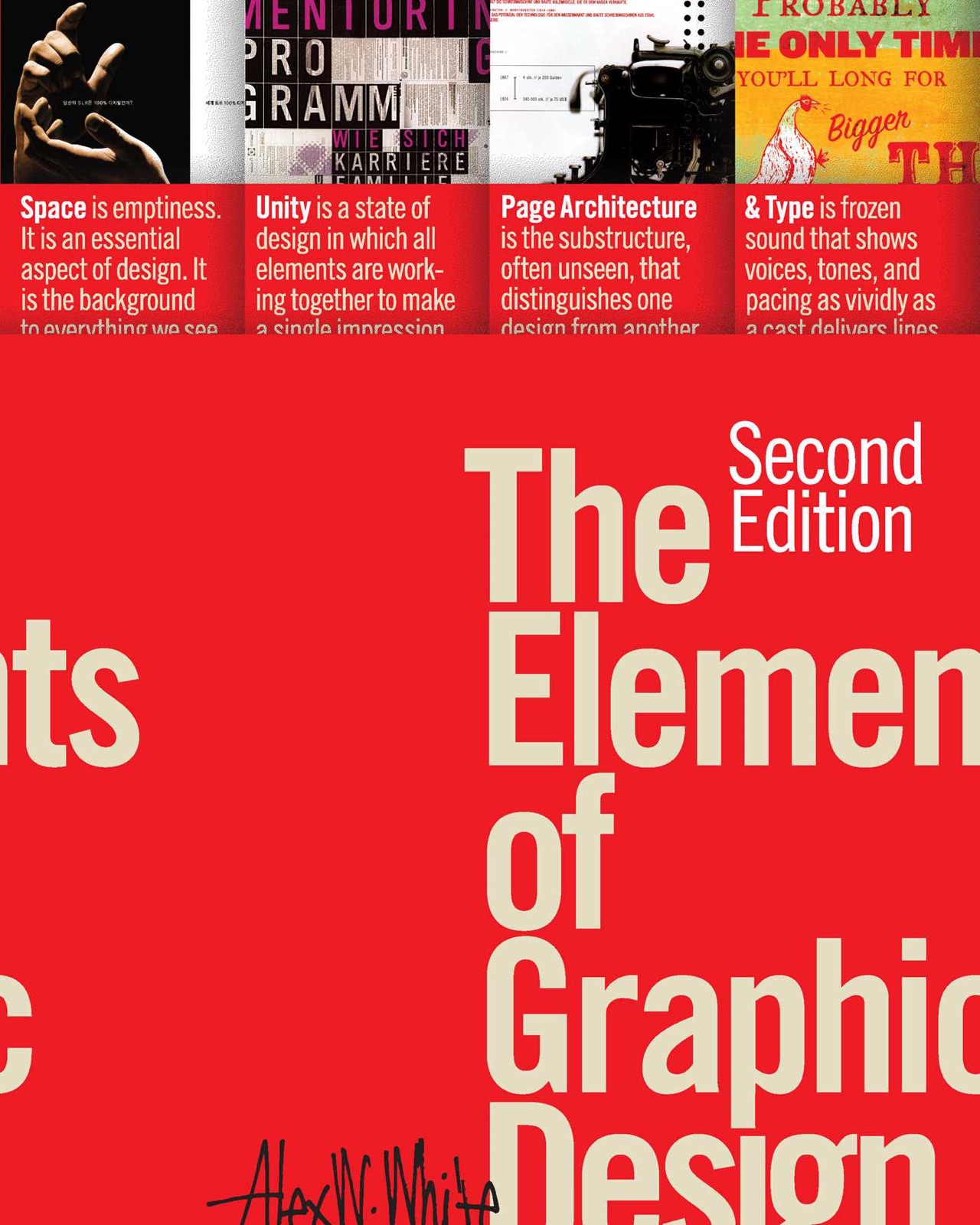 The Elements of Graphic DesignAlex W. White
 Universal Principles of DesignWilliam Lidwell, Kritina Holden, Jill Butler
 Designing for the Digital AgeKim Goodwin
 The Elements of Typographic StyleRobert Bringhurst
 The Non-Designer's Design BookRobin Williams
 The Visual Display of Quantitative InformationEdward R. Tufte
