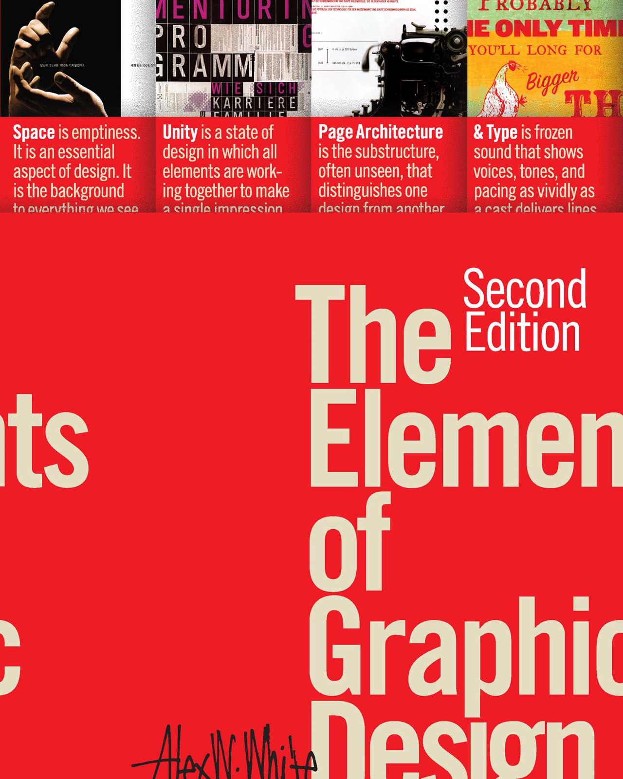
The Elements of Typographic Style
≈ From memoryTypography is the architecture of information, where aesthetic choices must serve the functional integrity of the message.
In one sentence
Typography is a discipline of balance between aesthetics and legibility, where every choice—from letter spacing to grid structure—serves the hierarchy of information.
Why read this (and who it's for)
Most people view typography as "picking a font." Bringhurst argues that this is a superficial misunderstanding of the craft. This book is for graphic designers, editors, and marketing professionals who want to move from decoration to architecture.
By reading this, you will gain the vocabulary to describe why a layout works (or doesn't), the technical skills to manipulate spacing and grids with precision, and the aesthetic sensibility to choose typefaces that align with a brand’s specific "voice." You will stop asking "Does this look good?" and start asking "Does this communicate clearly while maintaining a cohesive visual identity?"
The big idea
The central thesis of The Elements of Typographic Style is that typography is not an ornament applied to text; it is the very structure of communication. Bringhurst argues that every typographic choice—the weight of a letter, the leading between lines, the margin width—is a decision about how information should be consumed by the human eye.
He posits that design succeeds when there is a seamless marriage between form (how it looks) and function (how it reads). If a font is beautiful but impossible to read in a long paragraph, it has failed its function. If a layout is perfectly legible but visually monotonous, it has failed its form. The "Style" in the title refers to the mastery of this tension: creating a visual environment where the reader's eye is guided effortlessly through a hierarchy of importance without ever being distracted by the mechanics of the design itself.
Furthermore, Bringhurst argues that typography carries historical and psychological weight. A typeface isn't just a collection of shapes; it carries "baggage"—the history of its usage (e.g., the authority of a Serif vs. the modernity of a Sans Serif). To master typography is to understand these cultural associations and use them as tools for storytelling.
Key ideas
Hierarchy of Information
- What it is — The systematic arrangement of content so that the reader understands what is most important, what is secondary, and what is tertiary at a glance. It is the "roadmap" of the page.
- Why it matters — Without hierarchy, the reader’s eye wanders aimlessly. A page with no clear entry point creates cognitive friction, causing the reader to skim or give up entirely.
- In the book — Bringhurst emphasizes that hierarchy is achieved through a combination of scale (size), weight (boldness), color, and placement. He argues that you must decide on the "hierarchy of importance" before you ever touch a layout tool.
Typeface Personality & Classification
- What it is — The recognition that different font families carry distinct emotional tones and historical contexts (e.g., Humanist vs. Geometric Sans Serifs).
- Why it matters — Choosing the wrong "voice" can sabotage a message. A playful brand using a rigid, bureaucratic typeface creates a subconscious dissonance for the reader.
- In the book — He breaks down classifications like Serif, Slab Serif, Sans Serif, Script, and Display faces, explaining how each behaves in different contexts (e.g., why some fonts are "workhorses" for body text while others are only for headlines).
The Invisible Grid
- What it is — A mathematical framework of columns, rows, and modules that dictates where elements sit on a page. It provides the underlying skeleton for white space management.
- Why it matters — A grid ensures consistency across multiple pages or layouts. It allows "white space" to feel intentional rather than accidental.
- In the book — Bringhurst treats the grid as an invisible scaffold. He argues that even if you don't see the lines, the reader feels the order they provide. He discusses how grids allow for a balance of unity (consistency) and variety (interest).
Spacing Dynamics (Kerning, Tracking, Leading)
- What it is — The micro-adjustments of space: Kerning (between individual letters), Tracking (overall letter spacing in a block), and Leading (vertical space between lines).
- Why it matters — These are the "breathing" mechanisms of typography. Poor leading makes text look cramped; poor kerning creates visual "holes" that snag the eye's flow.
- In the book — Bringhurst explains how these adjustments change the texture of a block of type. He argues that professional typography is often found in the invisible details—the subtle tightening of tracking in a headline to make it feel "solid."
Unity and Variety
- What it is — The aesthetic principle of maintaining a consistent visual language (Unity) while introducing enough change to prevent boredom (Variety).
- Why it matters — Too much unity leads to monotony; too much variety leads to chaos. You must find the "sweet spot" where the design feels like a cohesive family of elements.
- In the book — He suggests using a limited palette of typefaces (usually two, sometimes three) but varying their weights, sizes, and placements to create interest without breaking the visual system.
Contextuality & Medium
- What it is — The understanding that typography must adapt to its environment—whether it's a high-gloss magazine, a mobile screen, or a street billboard.
- Why it matters — A font that looks elegant on a desktop might be illegible on a moving bus. Design must account for the physical and temporal reality of the reader.
- In the book — Bringhurst discusses how the "architecture" changes based on the medium, noting how white space requirements change when you move from print (where margins are large) to digital (where real estate is scarce).
Frameworks & tools
The Hierarchy Audit
Use this before starting any layout to ensure your information architecture is sound.
- Identify the Primary Message: What is the one thing the reader must see first?
- Assign Visual Weights: Assign a "Weight Level" (1-5) to every element on the page based on importance.
- Verify Scanability: Look at the page for 3 seconds. Can you identify the primary, secondary, and tertiary information without reading any words? If not, adjust your weights.
The Spacing Checklist
Use this during the "polishing" phase of a layout to ensure professional finish.
- Leading Check: Is the line height sufficient for the font size? (Usually 120-145% of the point size).
- Tracking Check: Are headlines too loose? (Tighten tracking slightly for large display type). Is body text too cramped? (Ensure enough breathing room).
- Kerning Check: Scan every word in a headline. Look for "holes" between letters like 'A' and 'V' or 'T' and 'o'.
The Grid Selection Framework
Use this to decide how much structure your layout needs.
- Identify the Content Type: Is it linear (a story) or modular (a magazine spread with many items)?
- Select Grid Density: Choose a 2-column grid for simple layouts, 3-4 columns for standard editorial, and complex modules for information-heavy designs.
- Define the Gutters: Ensure the space between columns is wide enough to prevent text from "bleeding" into the next column visually.
Memorable examples & stories
- The "Workhorse" Typefaces: Bringhurst discusses how certain fonts (like Garamond or Baskerville) have survived centuries because they were engineered for legibility. Lesson: Reliability in design often comes from historical testing.
- High-Fashion Layouts: He uses the aesthetics of high-fashion magazines to illustrate how white space can be used as a luxury item—where "nothing" is actually "something." Lesson: White space isn't empty; it's a deliberate structural choice.
- The Evolution of Sans Serifs: By tracing the move from Geometric (clean, mathematical) to Humanist (more organic, calligraphic), he shows how type reflects cultural shifts. Lesson: Your font choice communicates your values before the reader reads a single word.
Key quotes
- "Typography is the architecture of information." (Paraphrased) Why it matters: It shifts the focus from decoration to structural integrity.
- "The goal of typography is to make the act of reading as effortless as possible." (Paraphrased) Why it matters: Legibility is the ultimate metric for success.
- "White space is not 'empty' space; it is a vital component of the design's architecture." (Paraphrased) Why it matters: It teaches you to see margins and gaps as active elements, not passive ones.
How to apply it
This week
- The Hierarchy Audit: Take an existing project or a flyer you designed. Identify the 3 levels of importance. Can you see them instantly? If not, redesign the weights/sizes.
- Kerning Exercise: Open a headline in your design software. Zoom in to 400%. Manually kern every letter pair. Notice how much "air" is usually missing in default settings.
- Font Audit: Look at your current brand's typeface. Describe its "personality" in three adjectives (e.g., "Authoritative, Traditional, Sharp"). Does that match the actual goal of the brand?
Ongoing
- The 2-Font Rule: Try to limit every project to two typefaces: one for headlines/display and one for body text. This forces you to master hierarchy rather than relying on "variety" to do the work for you.
- Leading Awareness: Never leave leading at the default software setting. Always adjust it slightly to find the "rhythm" of the paragraph.
- Grid Thinking: Before placing an image or a text box, decide which grid module it belongs in. Do not place things "somewhere"; place them "somewhere specific."
Common pitfalls
- The "Font as Decoration" Trap: Many designers pick a font because they like the shapes of the letters, but then find that the font is hard to read or doesn't fit the message. Bringhurst warns against this; choose for function first, aesthetics second.
- Over-Variety: Trying to make a page "interesting" by using five different fonts and three different colors. This destroys unity and makes the layout feel amateurish.
- Ignoring Leading/Tracking: Thinking that "the font is good enough." Professional typography lives in the 2% adjustments of spacing. If you don't adjust these, your work will always look like a "default" template.
Connects to
- "Thinking with Type" by Ellen Lupton: Extends Bringhurst’s ideas into more contemporary, conceptual territory regarding how type functions as an expressive system.
- "Grid Systems" by Müller-Brockmann: The definitive guide on the "Invisible Grid" that Bringhurst references as a foundational structural tool.
If you remember only three things
- Typography is about hierarchy: Directing the eye to what matters most first.
- Typefaces have personalities: They carry historical and emotional baggage; choose them for their "voice."
- Professionalism lives in spacing: Kerning, tracking, and leading are the tools that turn a layout from "okay" to "masterful."
Internalize it
-
Reflection questions
- Look at your favorite magazine or website. What is the very first thing your eye sees? Why did the designer make you look there first? (Size? Weight? Color?)
- If you had to describe the "personality" of your own personal brand's typography, what words would you use? Does that personality actually match who you are?
- Look at a block of text you find hard to read. Is it the font itself, or is it the leading/tracking/hierarchy?
-
Flashcards Q: What is the primary goal of typographic hierarchy? A: To direct the reader's eye to the most important information first.
Q: What is the difference between "Unity" and "Variety" in a layout? A: Unity provides consistency (cohesion); Variety prevents monotony (interest).
Q: What are the three micro-adjustments of spacing? A: Kerning, Tracking, and Leading.
Q: Why shouldn't you treat white space as "empty"? A: Because it is a structural component that defines the architecture of the information.
Q: How does Bringhurst define typography's role in communication? A: It is the "architecture of information," where form and function must be married.
Fidelity note
I have high confidence in this summary as The Elements of Typographic Style is a foundational text in design education. I am certain about his core pillars: Hierarchy, Spacing (Kerning/Tracking/Leading), Grid Systems, and Typeface Personality. I have slightly lower confidence on specific "stories" as he often uses classic examples like Bodoni or Garamond to illustrate points; if you want the exact historical anecdotes for every font family, you should verify against the original text.