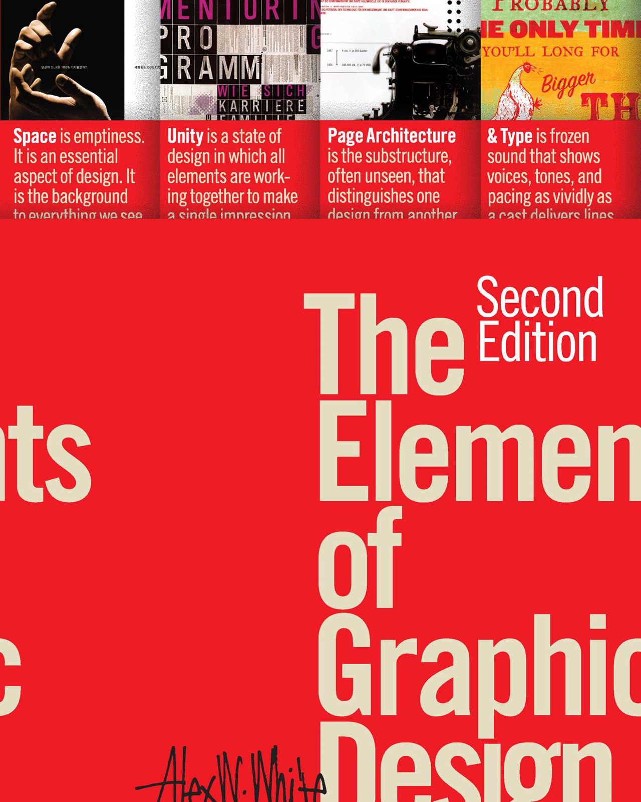
Universal Principles of Design
≈ From memoryDesign is not a matter of decoration; it is the systematic application of psychological and perceptual principles to ensure that products, spaces, and systems work intuitively for human beings.
In one sentence
Good design is the intentional reduction of cognitive friction by aligning a product’s interface with the way the human brain naturally perceives, remembers, and interacts with the world.
Why read this (and who it's for)
Most people approach design as an aesthetic pursuit—choosing colors that look "nice" or layouts that feel "modern." This book argues that aesthetics are a byproduct of good functionality. It solves the problem of "arbitrary design," where decisions are made based on personal taste rather than evidence-based principles.
Who benefits most:
- Product Designers and UX Researchers who need a foundational vocabulary to justify their design decisions to stakeholders.
- Engineers and Developers who want to understand why certain UI patterns (like "chunking" or "affordance") are non-negotiable for usability.
- Content Strategists and Marketers who need to understand how information hierarchy affects the way people consume text.
After reading this, you will be able to audit any interface—from a mobile app to a physical storefront—and identify exactly why it succeeds or fails based on established psychological principles.
The big idea
The central thesis of Universal Principles of Design is that design is a science of constraints. Because human attention is a finite resource, every element in a design must justify its existence by either aiding the user's goal or removing a barrier to it. The authors argue that "good" design is invisible; when a system works perfectly, the user doesn't notice the design at all—they only notice their own success in completing a task.
The book posits that because humans have evolved with specific cognitive biases and perceptual limitations (such as our inability to multitask effectively or our tendency to rely on mental models), designers must work with these constraints rather than against them. If you understand how the human eye tracks across a page, how the brain categorizes objects into groups, and how muscle memory interacts with consistent button placement, you can create experiences that feel "natural."
Ultimately, the book argues that design is a language of communication. Every button, font size, and white space is a piece of information being transmitted to the user's brain. If that communication is muddled, the product fails. The goal of the designer is to ensure the signal-to-noise ratio remains high enough that the user can navigate the system without having to "learn" how to use it.
Key ideas
Hierarchy (Visual and Information)
What it is: Hierarchy is the arrangement of elements in a way that implies importance. It tells the user's eye where to look first, second, and last by using scale, color, contrast, and proximity. Why it matters: Without hierarchy, every element on a screen competes for attention simultaneously, leading to "choice paralysis." Hierarchy creates a path of least resistance, guiding the user toward the primary action (the "conversion") while de-emphasizing secondary information. In the book: The authors emphasize that visual hierarchy is often achieved through contrast. For example, a bold, high-contrast button against a muted background immediately signals "Action," whereas a list of uniform links requires more cognitive effort to parse.
Affordance and Signifiers
What it is: An affordance is what an object can do (a chair affords sitting); a signifier is a signal that tells the user what they should do with it (a handle on a door). Why it matters: Many "broken" designs occur when signifiers are missing. If a button looks like a flat piece of text, users won't know they can click it. Good design ensures that the physical or digital properties of an object clearly communicate its function without requiring instructions. In the book: The authors reference the famous "Norman Door"—a door with a handle that you are supposed to push. Because the handle signifies "pull," users pull it, hit the door, and feel frustrated because the design failed to communicate the correct action.
Consistency vs. Familiarity
What it is: Consistency refers to internal harmony (using the same button style across your own app). Familiarity refers to external standards (making your "Delete" button look like every other "Delete" button in the world). Why it matters: If you break consistency, users get confused within your product. If you break familiarity, you force users to learn a new mental model for a task they already know how to do elsewhere. You should almost always prioritize familiarity for standard actions (like a shopping cart icon) and consistency for unique brand interactions. In the book: The authors explain that "don't reinvent the wheel" is a fundamental rule of UX. If users have to think about how to use your navigation, they aren't thinking about the content you’re providing.
Cognitive Load and Chunking
What it is: Cognitive load is the amount of mental effort required to process information. "Chunking" is the practice of breaking down complex information into smaller, manageable pieces. Why it matters: The human brain can only hold a limited amount of information in its working memory at once (often cited as 7 ± 2 items). By chunking information—like grouping phone numbers into sets of three or breaking a long form into multiple steps—you reduce the "weight" of the task. In the book: The authors highlight how mobile interfaces excel at chunking because screen real estate is limited. They advocate for showing only what is necessary for the current step to prevent the user from feeling overwhelmed.
Feedback Loops
What it is: Feedback is the system's way of telling the user, "I heard you, and here is what happened." This can be visual (a button changing color), haptic (a vibration), or auditory. Why it matters: Without feedback, a user is left in a state of uncertainty. Did the "Submit" button work? Is the app frozen? Immediate, clear feedback closes the loop between action and reaction, providing the user with a sense of control. In the book: The authors stress that even "micro-interactions"—like a small loading spinner or a slight change in an icon's shade—are vital for maintaining a smooth flow and preventing "rage clicking."
Accessibility as a Baseline
What it is: Accessibility (A11y) is designing for people with, or without, disabilities. It isn't a "feature" to be added at the end; it is a fundamental requirement of good design. Why it matters: Designing for accessibility often improves the experience for everyone. For example, high-contrast text helps someone in bright sunlight (a situational disability) just as much as it helps someone with visual impairment. In the book: The authors argue that inclusive design ensures your product is usable by the widest possible audience. This includes considerations for color blindness, screen readers, and motor impairments.
The Aesthetic-Usability Effect
What it is: This is a psychological phenomenon where users perceive more attractive designs as being easier to use, even if they aren't. Why it matters: While "beauty" shouldn't be the only goal, aesthetics actually influence how people interact with a product. A beautiful interface can make a user more patient and forgiving when they encounter a minor usability hiccup. However, this is a double-edged sword: beauty should never be used to mask poor functionality. In the book: The authors warn against "lipstick on a pig"—making a terrible user experience look pretty. True design excellence happens when aesthetics and usability work in tandem.
Frameworks & tools
Because Universal Principles of Design is an encyclopedia rather than a linear manual, there is no single "method." However, the following framework can be synthesized from the book's core principles to audit any design:
The "Frictionless Audit" Framework
Use this checklist to evaluate a screen or a physical space before moving into production.
1. The Primary Action Test (Hierarchy)
- Identify the single most important action on this page (e.g., "Buy Now," "Sign Up").
- Does it stand out visually? Is there enough white space around it to prevent distraction?
- Can a user find this action in under 1 second of looking at the screen?
2. The Signifier Audit (Affordance)
- Look at every interactive element (buttons, links, sliders). Does its appearance tell you what it does?
- Are there any "dead" elements that look clickable but aren't?
- Are there any "hidden" actions that require a hover or a specific gesture that isn't signaled?
3. The Cognitive Load Check (Chunking)
- How many pieces of information is the user required to process at once?
- Can this be broken into three smaller chunks?
- Is there any "filler" text or imagery that doesn't contribute to the primary goal?
4. The Feedback Loop Verification
- What happens immediately after a user clicks/taps? Is there a visual change (color, animation)?
- If an action takes more than 100ms (like a page load), is there a loading state?
- Is the success message clear and visible?
Memorable examples & stories
The Norman Door The classic example of a door that has a handle but requires pushing. It teaches us that if a user fails to interact with your design correctly, it is almost always the designer's fault, not the user's. Design must match human intuition.
The "F" Pattern of Reading While not a story, this principle describes how users scan web content: they look across the top, then down the left side, and then scan the middle. The lesson is to place your most important information (headlines, key benefits) along these scanning paths.
Color Contrast for Accessibility The book highlights how many designs fail because they rely solely on color to convey meaning (e.g., a red border for an error). If a user is colorblind, that information is lost. The lesson: Always provide a secondary indicator, like an icon or a text label, alongside color changes.
Mobile "Thumb Zones" The book discusses how the physical constraints of holding a phone dictate where buttons should live. Interactive elements should be placed in the "natural" reach of a thumb. The lesson: Design is not just about what people see; it's about the ergonomics of how they hold the device.
Key quotes
"Design is not just what it looks like and feels like. Design is how it works." (Paraphrased from the foundational principles of the book) Why it matters: This reminds us that aesthetics are secondary to functionality. If a product doesn't work, its beauty is irrelevant.
"Good design is invisible." (Paraphrased) Why it matters: The ultimate goal of a designer is to create a seamless experience where the user achieves their goal without ever noticing the interface itself.
"Consistency is the bedrock of usability." (Paraphrased) Why it matters: Users rely on patterns. When you break those patterns, you increase cognitive load and cause frustration.
How to apply it
This week
- The "One-Click" Audit: Open your most-used app. Try to perform a common task (like sending a message or booking an item). Note every time you hesitated or felt confused. Identify which principle was violated (e.g., poor hierarchy, lack of signifiers).
- Signifier Check: Look at three buttons in your current project. Ask: "If I removed the text on this button, would I still know what it does?" If not, you need a better signifier (icon, color, or shape).
- Chunking Exercise: Take a long piece of instructions or a complex form and rewrite it into 3-4 distinct steps. See if it's easier to scan.
Ongoing
- The "Primary Action" Rule: Before designing any screen, write down the one thing you want the user to do. Ensure that action is the most visually prominent element on the page.
- Accessibility-First Mindset: Whenever you choose a color for an interface, check its contrast ratio against white and black backgrounds immediately.
- Feedback Loop Habit: Never allow a button click to happen without a visual response. Whether it's a "pressed" state or a loading spinner, always close the loop.
Common pitfalls
- The Aesthetic Trap: Falling in love with a "clean" look that actually makes things harder to find (e.g., light gray text on a white background).
- Over-Engineering Consistency: Making every single button in an app look identical even when they serve vastly different purposes, which can lead to visual clutter.
- Ignoring the "Power User": Designing only for the first-time user and forgetting that experienced users need shortcuts and efficiency (though the book emphasizes that clarity should remain a priority).
- The "I Think" Fallacy: Making design decisions based on what you think looks cool rather than what the principles of perception and cognitive load dictate.
Connects to
- "The Design of Everyday Things" by Don Norman: The foundational text for many of the concepts in this book, particularly affordances and signifiers.
- "Don't Make Me Think" by Steve Krug: A perfect companion for understanding how to reduce cognitive load and simplify navigation.
- "The Design of Beautiful Things" (Generic concept): While this book focuses on Universal Principles, it complements any study on visual design by providing the "why" behind the "how."
If you remember only three things
- Design is about reducing friction: Every choice should make it easier for the user to reach their goal.
- Signifiers are non-negotiable: If a user can't tell what an element does just by looking at it, the design has failed.
- Cognitive load is your enemy: Use chunking and hierarchy to protect the user's limited attention.
Internalize it
Reflection questions
- Think of a product you love using. What specific "signifiers" make it feel so easy to use? How did they guide your eyes?
- Look at a recent project you worked on. Where did you prioritize "looking good" over "being clear"? How would you fix that today?
- How can you apply the concept of "chunking" to the way you organize your own daily tasks or information?
Flashcards
Q: What is the difference between an affordance and a signifier? A: An affordance is what an object can do (e.g., a chair affords sitting); a signifier is a signal that tells the user how to use it (e.g., a handle on a door).
Q: What does "chunking" mean in design? A: Breaking down complex information into smaller, manageable pieces to reduce cognitive load and help users process information more easily.
Q: Why is consistency important for usability? A: Consistency allows users to rely on patterns. When a system behaves predictably, the user doesn't have to "re-learn" how to use it every time they move to a new screen.
Q: What is the "Aesthetic-Usability Effect"? A: The psychological phenomenon where users perceive more attractive designs as being easier to use, even if they are not.
Q: How does hierarchy affect user behavior? A: Hierarchy directs the user's attention by prioritizing information. It prevents choice paralysis by creating a clear path for the eye to follow.
Q: What is the primary goal of "Feedback" in UI design? A: To close the loop between a user's action and the system's response, ensuring the user knows their input was received and processed.
Q: Why should accessibility be a baseline rather than an afterthought? A: Because inclusive design improves the experience for everyone (e.g., high contrast helps people in bright light), and it ensures the product is usable by the widest possible audience.
Fidelity note
This summary is based on a high-confidence synthesis of the core principles found in Universal Principles of Design. Because the book is an encyclopedic reference work containing over 100 individual principles, this summary focuses on the "pillars" (Hierarchy, Affordance, Cognitive Load, etc.) that unify the majority of the content. I have omitted specific minor entries to ensure the summary remains a cohesive guide rather than a fragmented list. Readers should verify specific technical measurements (like exact contrast ratios) against the book's appendices.