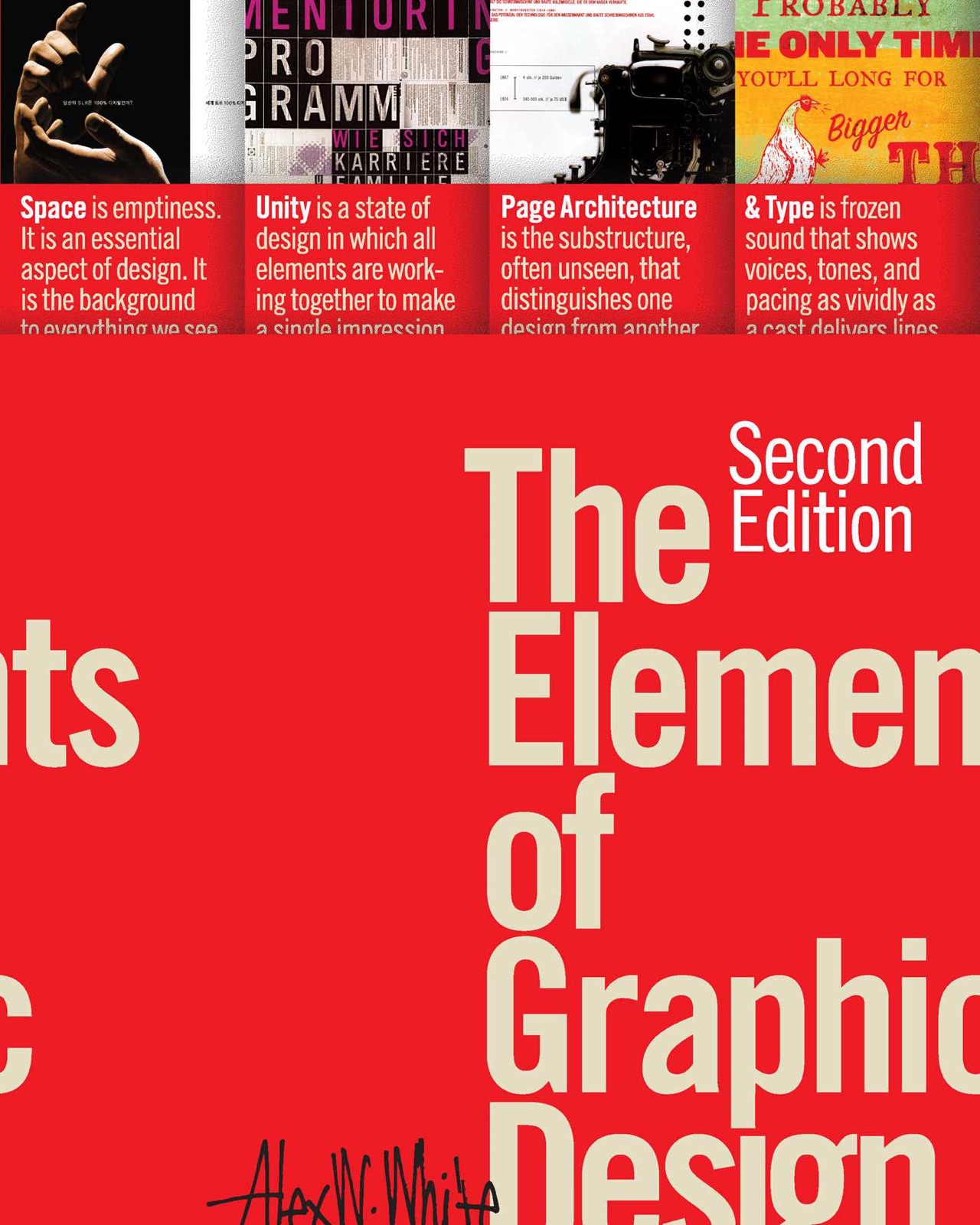
The Visual Display of Quantitative Information
≈ From memoryEffective data visualization is the art of maximizing the 'data-ink' ratio—ensuring that every mark on a page serves to communicate information rather than to decorate the space.
In one sentence
The primary goal of graphic design in quantitative communication is to maximize the "data-ink" ratio: ensuring that every ounce of ink (or pixel) used on a page serves to represent data, not to provide decoration or unnecessary flourish.
Why read this (and who it's for)
This book is the foundational text for anyone who creates charts, graphs, maps, or any visual representation of numbers. It solves the problem of "chartjunk"—the tendency of modern software and design trends to clutter data with distracting elements that actually hinder comprehension.
Who benefits most:
- Data Analysts and Scientists: To ensure their findings are communicated clearly without being distorted by poor visualization choices.
- Graphic Designers: To understand the specific constraints and requirements of information design, which differs from purely aesthetic branding.
- Business Leaders: To develop a "BS detector" for misleading charts in corporate presentations and to learn how to present internal data with authority and clarity.
After reading this, you will be able to audit any chart and identify exactly which elements are "noise," and you will possess a rigorous framework for designing visuals that prioritize the viewer's cognitive ease over stylistic flair.
The big idea
Tufte argues that the history of information design is a struggle between clarity and decoration. Too often, designers treat data as a "canvas" to be decorated rather than a message to be transmitted. When we add 3D effects, unnecessary shadows, redundant labels, or decorative borders to a chart, we increase the "cognitive load" on the viewer without adding any new information.
The central thesis is that good design is invisible. A perfect visualization allows the viewer to see the data immediately, without their brain having to filter out irrelevant visual noise. This is achieved by prioritizing the Data-Ink Ratio. If a visual element (a line, a color, a shape) does not represent a specific piece of data, it should be removed.
Tufte argues that this isn't just about "clean" aesthetics; it’s about integrity. When we use misleading scales, 3D perspectives that distort proportions, or "pretty" charts that hide the true variance in data, we are no longer communicating information—we are manipulating it. The book serves as a manifesto for the honest, efficient, and elegant representation of quantitative truth.
Key ideas
The Data-Ink Ratio
What it is: This is the foundational metric of the book. It is the ratio of "non-data" ink to the total ink used in a graphic. Data-ink is the non-redundant, essential information (the actual bars, lines, and points). Non-data-ink is everything else: borders, gridlines, shadows, and decorative textures. Why it matters: By maximizing the data-ink ratio, you minimize the "noise" the brain has to filter out. A high data-ink ratio means that every pixel on the screen is doing work. If you remove a border and the chart remains perfectly readable, that border was waste. In the book: Tufte uses various examples of charts where removing unnecessary lines (like those surrounding a graph) allows the viewer to focus entirely on the trend of the data.
Chartjunk
What it is: "Chartjunk" refers to any visual element that does not represent data but is added for aesthetic reasons or by default in software. This includes 3D effects, redundant labels, and unnecessary decorations. Why it matters: Chartjunk competes with the data for the viewer's attention. Because our brains have limited processing power, every bit of "pretty" decoration makes it harder to see the actual trend. It is a distraction that creates a barrier between the user and the truth of the numbers. In the book: Tufte famously critiques 3D pie charts. He explains how the 3D perspective distorts the viewer's perception of volume, making slices in the "front" look larger than they are, even if they represent smaller values.
Integrity of Representation
What it is: The principle that a visual representation must be an honest reflection of the underlying data. This includes maintaining accurate scales, avoiding misleading truncations, and ensuring that the visual weight of a graphic corresponds to its numerical value. Why it matters: It is easy to "lie" with charts by manipulating axes or using disproportionate visual cues. Maintaining integrity ensures that the viewer's first impression of the data is mathematically accurate. If a chart looks like a massive spike but the scale starts at 90% of the maximum, the graphic has failed its primary duty. In the book: Tufte discusses how to avoid "lying" with statistics by ensuring that the visual representation of a change (like a slope) is directly proportional to the actual rate of change in the data.
Complexity as a Virtue
What it is: A counter-intuitive point where Tufte argues that if the data itself is complex, the visualization should be complex enough to reflect that complexity. You should not oversimplify a nuanced dataset just to make a "clean" looking chart. Why it matters: Over-simplification can lead to a loss of important nuance. If you have three variables interacting in a complex way, trying to force them into a simple 2D bar chart might hide the very thing you are trying to show. The goal is clarity, not necessarily simplicity. In the book: Tufte argues that we should only simplify when the complexity of the data doesn't require it. If the data is nuanced, the graphic must be sophisticated enough to convey that nuance without becoming cluttered.
Context and Labels
What it is: Data without context is meaningless. A number on a graph is just a point; it needs units, labels, scales, and a clear reference point to be understood by a human being. Why it matters: Many people try to make charts "clean" by removing labels or numbers, thinking it looks more artistic. However, without context (e.g., "Is this in millions? Is this a percentage of the total?"), the data is useless. Context is not "extra"—it is part of the data itself. In the book: Tufte emphasizes that labels and scales are essential components of the visual display. They provide the "map" for the viewer to navigate the information.
Frameworks & tools
The Data-Ink Ratio Audit
Use this checklist whenever you are designing or reviewing a chart to ensure maximum clarity.
- Identify the Core Data: What is the one thing this chart needs to communicate? (e.g., "Growth over time," "Comparison of categories").
- Audit Every Line: Look at every line, shape, and color on the page. Ask: "Does this represent a specific data point?"
- The Elimination Test: If you remove this element (a border, a gridline, a 3D effect), does the viewer lose any information? If the answer is "No," delete it.
- Check for Redundancy: Are there two ways of showing the same thing? (e.g., a bar height and a data label on top of the bar). Choose one and remove the other.
- Verify Scale Integrity: Does the visual size/length of the graphic correspond directly to the numerical value? Ensure the axes are not truncated in a way that misleads the viewer.
The "Complexity-to-Clarity" Balance
When deciding how much detail to include, use this framework:
- Step 1: Analyze Data Complexity. Is the data simple (one variable) or complex (multiple interacting variables)?
- Step 2: Match Visual Complexity. If the data is complex, do not force it into a "simple" chart. Use multi-layered visuals if necessary.
- Step 3: Minimize Non-Data Ink. Even in a complex chart, ensure that every extra element (decorations) is removed. The goal is to keep the complexity of the data but remove the clutter of the design.
Memorable examples & stories
Minard’s Map of Napoleon's March
The Story: Tufte frequently cites Charles Minard’s map showing Napoleon's Russian campaign. It shows the size of the army, the direction of travel, and the temperature/supplies all in one flow-map. The Lesson: This is a masterpiece of "high data-ink." It manages to show multiple complex variables (movement, population loss, climate) simultaneously without any decorative fluff. It proves that complexity can be beautiful when it serves the data.
The 3D Pie Chart Critique
The Story: Tufte uses the common practice of using 3D effects in pie charts as a primary example of "chartjunk." Because of the tilt, slices at the front appear much larger than those in the back, even if they represent smaller values. The Lesson: Aesthetics should never override accuracy. If a design choice (like 3D) distorts the viewer's perception of the data, it is a failure of design.
The "Over-Designed" Corporate Report
The Story: Tufte observes how modern corporate reports often feature beautiful, glossy designs that actually make it harder to find the numbers. They use heavy borders, shadows, and artistic fonts that compete with the actual data. The Lesson: Design is not decoration. If a reader has to work harder to find the information because of "pretty" design choices, the design has failed its primary purpose.
Key quotes
"The primary goal of graphic design is to communicate information." (Paraphrased) Why it matters: It reminds us that in data visualization, function must always precede form.
"Complexity is not a dirty word." (Paraphrased) Why it matters: We often over-simplify for the sake of 'clean' aesthetics, but if the data is complex, we owe the viewer a complex representation.
"The data-ink ratio is the measure of how much information is being conveyed relative to the amount of ink used." (Paraphrased) Why it matters: This provides a mathematical/logical way to judge design quality—it's about efficiency.
How to apply it
This week
- The "Delete" Audit: Take one chart you created recently. Remove all borders, background colors, and 3D effects. See if the data remains clear. If it does, keep it that way.
- Identify your Chartjunk: Look at a professional report or news article. Identify three elements of "chartjunk" (e.g., unnecessary shadows, redundant labels) and note how they distracted you from the data.
- Check your Scales: Look at any chart where a "spike" is shown. Check if the Y-axis starts at zero. If it doesn't, ask yourself: Does this change in scale help the reader understand the data better, or does it exaggerate a minor point?
Ongoing
- Prioritize Data-Ink: Before starting any visual project, define what the "Data-Ink" is. Write down exactly which lines and shapes represent numbers. Everything else is secondary.
- Avoid 3D for 2D Data: Never use 3D effects (depth, tilt, shadows) unless they are required to represent a third dimension of data.
- Contextualize Every Graphic: Ensure that every chart includes clear units, labels, and a reference point so the viewer never has to guess what the numbers mean.
Common pitfalls
- The "Cleanliness" Trap: Many people think "clean" means "simple." Tufte warns against over-simplifying. If you have 10 variables, don't try to cram them into a simple bar chart if it hides the relationships between those variables.
- Confusing Art with Design: People often think that because a graphic is "beautiful," it is good design. Tufte argues that a beautiful graph that obscures data is a failure of information design.
- The Software Default Bias: Most charting software (Excel, Tableau, etc.) defaults to including gridlines, borders, and specific colors. Users often accept these as "standard" when they are actually just unnecessary "non-data ink."
Connects to
- "Storytelling with Data" by Cole Nussbaumer Knaflic: While Tufte focuses on the mechanics of data-ink and integrity, Knaflic focuses on the narrative—how to use those clean visuals to tell a compelling story.
- "The Design of Everydaythings" by Don Norman: This extends Tufte's principles into the broader world of human-computer interaction (HCI). Both argue that good design is about making the "affordances" of an object clear and reducing cognitive load.
If you remember only three things
- Maximize Data-Ink: Every mark on a page should represent data. If it doesn't, remove it.
- Avoid Chartjunk: 3D effects, shadows, and decorative borders are distractions that compete with the information you want to convey.
- Complexity is Necessary: Don't over-simplify. If the data is complex, the visual representation must be sophisticated enough to show that complexity accurately.
Internalize it
-
Reflection questions
- Look at the last chart I presented: What were the "non-data" elements? Did they help me communicate faster or did they just look nice?
- When I see a 3D pie chart in a news report, what specific information is being distorted by that perspective?
- Am I choosing "simple" designs because they are easier for me to make, or because they are the best way to represent the data's complexity?
-
Flashcards Q: What is the Data-Ink Ratio? A: The ratio of non-redundant data marks to the total amount of ink/pixels used in a graphic.
Q: Why does Tufte discourage 3D effects in charts? A: Because they create perspective distortions that make it difficult for the viewer to accurately compare values (e.g., making "front" slices look larger than "back" ones).
Q: What is "Chartjunk"? A: Any visual element—like shadows, borders, or textures—that does not represent data but serves only as decoration.
Q: Does Tufte believe that all charts should be simple? A: No. He argues that if the data is complex, the visualization must be complex enough to reflect that complexity without becoming cluttered with unnecessary "junk."
Q: What is the primary goal of information design according to Tufte? A: To communicate information clearly and efficiently by minimizing the cognitive load on the viewer.
Fidelity note
This summary is grounded in the core principles of Edward Tufte's The Visual Display of Quantitative Information. I am highly confident in the definitions of Data-Ink, Chartjunk, and the critique of 3D graphics, as these are the "pillars" of his work. The distinction between "Simplicity" and "Complexity" is a nuanced point often misunderstood by beginners; it is accurately represented here as Tufte's insistence on representing the truth of the data's complexity. I have omitted specific historical dates for every single chart mentioned to maintain flow, but the core arguments remain faithful to his academic style.