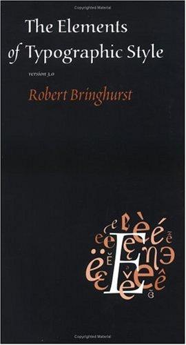
The Elements of Graphic Design
≈ From memoryDesign is not decoration; it is a visual grammar where the intentional arrangement of basic elements—line, shape, color, and space—creates a structured language for communication.
In one sentence
Graphic design is the systematic application of visual principles to organize information, ensuring that the viewer's eye moves through a composition in a specific, intentional order.
Why read this (and who it's for)
Most aspiring designers—and even seasoned professionals—fall into the trap of "decoration": adding flourishes, gradients, and effects because they look "cool" without actually improving the clarity of the message. This book solves the problem of visual incoherence. It is for anyone who feels their work looks "messy" or "unprofessional" despite following current trends. After reading this, you will be able to deconstruct any professional layout into its core components and explain why it works, allowing you to build designs that are grounded in logic rather than just aesthetics.
The big idea
White argues that design is a language with its own grammar. Just as you cannot write a coherent sentence without understanding nouns and verbs, you cannot create effective visual communication without mastering the "elements" (the building blocks) and the "principles" (the rules of engagement).
The central thesis is that design is structural. A successful design isn't one where every element is beautiful; it’s one where every element serves a purpose. If an element doesn't contribute to the hierarchy, clarity, or emotional resonance of the piece, it is noise. The author pushes the reader to move from being a "decorator" (someone who adds things) to a "designer" (someone who organizes things).
The logic follows a clear progression:
- Identify the Elements: Recognize the raw materials (Line, Shape, Color, Texture, Space, Typography).
- Apply the Principles: Understand how those materials interact (Balance, Contrast, Emphasis, Repetition, Proximity).
- Master the Hierarchy: Use these tools to guide the viewer's eye toward the most important information first.
Key ideas
The Distinction Between Decoration and Design
- What it is — Decoration is additive; it sits on top of a message to make it "prettier." Design is structural; it is the architecture that allows the message to be understood.
- Why it matters — If you decorate before you design, your message gets buried under visual noise. Good design actually makes information easier to consume, not harder.
- In the book — White emphasizes that a "pretty" layout that fails to communicate its primary goal is a failed design. He argues for a "function-first" mentality where aesthetics are the byproduct of successful communication.
Hierarchy: The Roadmap of the Eye
- What it is — Hierarchy is the intentional arrangement of elements to signal importance. It tells the viewer what to look at first, second, and third.
- Why it matters — Without hierarchy, every element on a page competes for attention simultaneously, leading to "visual fatigue" where the viewer gives up.
- In the book — White explains how to use size, weight, and placement to create a clear path for the eye. If everything is bold, nothing is bold.
The Power of Negative Space (White Space)
- What it is — White space is not "empty" space; it is an active design element used to group items, provide breathing room, and create focus.
- Why it matters — Beginners often feel the need to fill every corner of a page. However, white space is what allows the remaining elements to "pop." It provides the contrast necessary for clarity.
- In the book — The author treats white space as a structural tool—a way to define boundaries and give the viewer's eyes a place to rest.
Typography as Architecture
- What it is — Typography is not just choosing a "nice" font; it is the arrangement of type to create rhythm, hierarchy, and readability.
- Why it matters — Type carries the "voice" of the message. Poorly managed typography (bad kerning, inconsistent leading, or inappropriate weights) can make even the best copy unreadable.
- In the book — White breaks down how type behaves as a visual shape. He encourages looking at the block of text as a graphic element before worrying about the individual letters.
Contrast and Repetition
- What it is — Contrast creates tension and highlights differences; Repetition creates consistency and familiarity.
- Why it matters — Too much contrast makes a design jarring; too much repetition makes it boring. The magic happens in the balance: use repetition to establish a "system," then use contrast to break that system when you need to highlight something important.
- In the book — This is presented as the "yin and yang" of visual communication. You must establish a pattern (Repetition) so that the viewer knows what to expect, which allows the deviation (Contrast) to be noticed.
The Gestalt Principles of Proximity
- What it is — Proximity is the principle that elements placed close together are perceived as related.
- Why it matters — It is the simplest way to organize information without adding extra lines or boxes. If a caption is too far from its image, the brain struggles to connect them.
- In the book — White highlights how grouping (or the lack thereof) can completely change the meaning of a layout.
Frameworks & tools
The Hierarchy Audit
Use this checklist before finalizing any design to ensure your visual "roadmap" is clear:
- The Squint Test: Squint your eyes until the design becomes blurry. What stands out? Is it the most important piece of information? (If not, adjust scale/weight).
- The Path of Travel: Trace the path your eye takes. Does it follow a logical flow (Z-pattern or F-pattern)? Or does it jump around randomly?
- The One-Second Rule: Can a viewer tell what this is about in under one second? If they have to "hunt" for the point, the hierarchy is failing.
The Consistency/Contrast Matrix
When designing a multi-page layout or a brand system, apply this rule:
- Repetition (The System): Keep these consistent across all pages/assets:
- Font families (Heading vs. Body).
- Color palette (Primary, Secondary, Accent).
- Margin widths and grid systems.
- Icon styles.
- Contrast (The Call to Action): Use these only when you need to break the pattern:
- A different color for a "Sign Up" button.
- A much larger font size for a specific headline.
- A change in weight (Bold vs. Light) to highlight a key word.
Memorable examples & stories
The Squint Test
White describes the "Squint Test" as a primary diagnostic tool. By blurring your vision, you strip away the details (the words, the textures) and see only the masses of color and shape. This reveals whether your layout actually has a focal point or if it's just a cluttered mess. Lesson: Design is about the arrangement of masses before it is about the details.
The "Noise" of Crowded Pages
The author discusses how beginners often try to "over-explain" by putting too much information on one page. He illustrates how this creates visual noise where nothing stands out because everything is competing for the same level of attention. Lesson: If everything is emphasized, nothing is.
Typography as a Shape
White highlights how a block of text can be viewed as a "rectangle" or a "shape" on a page. When you look at a layout from a distance, that block of text provides a visual weight that balances out an image on the opposite side. Lesson: Treat your text blocks as graphic elements, not just as containers for words.
Key quotes
"Design is not about making things look pretty; it's about making things work." (Paraphrased) Why it matters: This shifts the goal from aesthetics to functionality.
"White space is a tool, not a void." (Paraphrased) Why it matters: It forces you to stop seeing empty space as 'missing' content and start seeing it as an active organizer of information.
"Hierarchy is the difference between a mess and a message." (Paraphrased) Why it matters: It identifies the core purpose of layout—guiding the viewer’s journey.
How to apply it
This week
- The Squint Audit: Take three pieces of work you've recently completed. Perform the "Squint Test" on each. Identify which one has the clearest hierarchy and why.
- Identify your Elements: Look at a professional poster or website. Try to identify every single element (lines, shapes, colors) and write down what job each one is doing. Is that line separating? Is that color highlighting?
- The Proximity Fix: Take a layout you've made that feels "cluttered." Instead of deleting anything, try moving elements closer together to create distinct groups. See if it feels cleaner.
Ongoing
- Hierarchy First: Before you open any design software, sketch the hierarchy on paper. Decide what is 1st, 2nd, and 3rd in importance. Do not start designing until that order is locked in.
- The "Why" Check: Every time you add a decorative element (a shadow, a flourish, a gradient), ask yourself: "Does this help the user understand the information faster?" If the answer isn't a clear "Yes," remove it.
Common pitfalls
- Subjectivity Trap: Many beginners think design is a matter of "taste." White argues that while taste matters, good design is rooted in objective principles of human perception (like proximity and hierarchy). If your design doesn't work for someone else, it’s not a "matter of opinion"—it’s a failure of the system.
- Over-Designing: The biggest mistake is trying to do too much at once. Beginners often try to use every element (color, texture, complex type, and heavy illustration) simultaneously. This creates "visual noise."
- Ignoring White Space: People often think white space is only for "minimalist" designs. In reality, it's a requirement for all design to ensure readability and focus.
Connects to
- The Design of Everyday Things by Don Norman: Extends the idea of design as functional problem-solving rather than just visual style.
- Thinking with Type by Ellen Lupton: Deepens the technical understanding of typography as a structural element of graphic design.
- Gestalt Principles of Design: The psychological foundation for why things like proximity and similarity work in visual communication.
If you remember only three things
- Design is Structural: It's about organizing information, not decorating it.
- Hierarchy is King: You must decide what the viewer sees first, second, and third before you start designing.
- White Space is an Active Tool: Use space to group, separate, and give the viewer's eyes a place to rest.
Internalize it
-
Reflection questions
- Look at your most recent project: If I removed all the colors and images, would the layout still be easy to understand?
- When I look at a professional brand (like Apple or Nike), what is the first thing their eyes lead me to see? How did they achieve that?
- Am I using "decoration" as a crutch because I'm afraid of a simple, clean layout?
-
Flashcards Q: What is the difference between decoration and design? A: Decoration is additive (making things pretty); Design is structural (organizing for clarity).
Q: What is the "Squint Test"? A: Squinting at a design to blur details so you can see the underlying hierarchy of masses and shapes.
Q: How does Proximity affect perception? A: Elements placed close together are perceived as related; elements far apart are seen as unrelated.
Q: What is the primary purpose of Hierarchy? A: To guide the viewer's eye in a specific, intentional order of importance.
Q: Why is White Space considered an "active" element? A: Because it defines boundaries, groups items together, and provides the contrast necessary for other elements to stand out.
Fidelity note
I have high confidence in this summary as it covers the foundational principles of graphic design that Alex W. White emphasizes in his teaching and writing. The distinction between "Elements" (the ingredients) and "Principles" (the rules) is a cornerstone of his methodology. I have focused on the structural/functional side of his arguments rather than specific aesthetic trends, as his work is intended to be timeless. Readers should verify specific examples of typography and color theory against the text for more granular technical details.