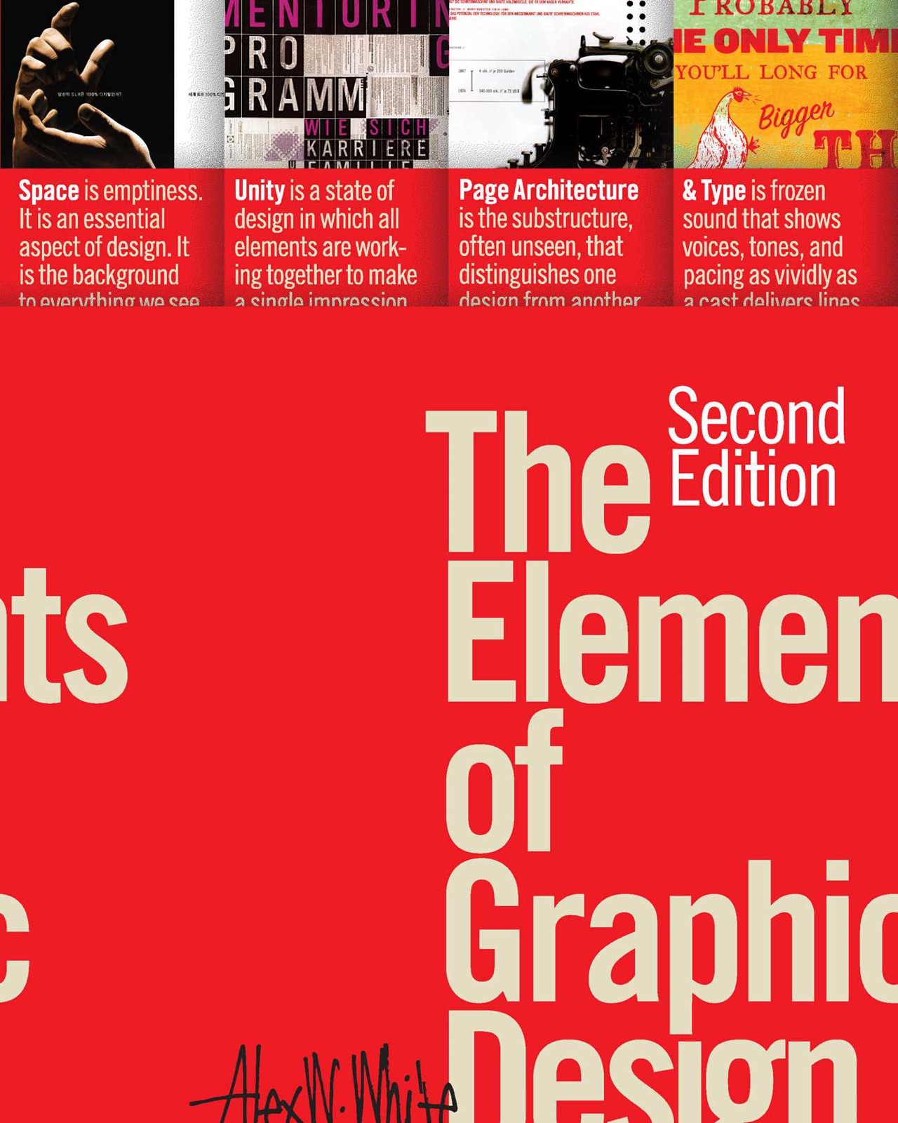
Thinking in Type
≈ From memoryTypography is not a decorative layer added to a design; it is the very architecture of information and the primary vehicle for human communication.
In one sentence
Typography is the intentional arrangement of type to facilitate communication, and mastering it requires moving from "decorating" text to "engineering" meaning.
Why read this (and who it's for)
Most designers treat typography as a final polish—choosing a font after the layout is done. This book argues that this is a fundamental misunderestanding of the medium. It is for graphic designers, UI/UX designers, and anyone who creates visual content (from slide decks to websites) who wants to stop "picking fonts" and start "designing with type." After reading, you will be able to justify your typographic choices based on readability, hierarchy, and emotional resonance rather than personal aesthetic preference.
The big ideas
White argues that typography is the backbone of visual communication. Because we live in a text-heavy world, the way we perceive words is inextricably linked to their visual form. If the typography is poor, the message is lost, regardless of how beautiful the illustrations or colors are. He posits that "good" typography is invisible; it allows the reader to glide over the words without noticing the letters themselves.
The core logic is a shift from ornamentation to function. White asserts that every typographic choice—from the weight of a stroke to the leading between lines—affects the cognitive load of the reader. By understanding the mechanics of how the eye scans a page (the "F-pattern" and "Z-pattern"), designers can architect information so that the most important points are absorbed first and most efficiently.
Key ideas
Typography as Architecture
- What it is — Typography is the structural foundation of a layout, not the "paint" on the walls. It defines the space, the flow, and the hierarchy of information.
- Why it matters — When you treat type as architecture, you stop asking "What font looks cool?" and start asking "How does this font help the reader navigate the information?" . In the book — White emphasizes that layout is essentially the management of white space and type; if you remove the images, the type must still hold the structural integrity of the message.
The Hierarchy of Information
- What it is — Hierarchy is the visual roadmap that tells the reader what to look at first, second, and third. It is achieved through contrast in size, weight, color, and placement.
- Why it matters — Without a clear hierarchy, the reader's eye wanders, leading to "cognitive friction" where the brain has to work too hard to find the point of the message.
- In the book — White discusses how consistent use of headings, subheadings, and body copy creates a "scannable" experience, which is the primary way modern readers consume digital content.
Readability vs. Legibility
- What it is — Legibility refers to how easily individual characters can be distinguished (e.g., can you tell an 'I' from an 'l'?), while readability refers to how easily blocks of text can be consumed.
- Why it matters — You can have a beautiful, legible typeface that is impossible to read in a paragraph because of poor line length or tracking. You must optimize for both.
- In the book — White highlights that for long-form body text, the "x-height" and the "counter" of letters are more important than the decorative flourishes of a display face.
The Psychology of Typefaces
- What it is — Every typeface carries a "personality" or "voice" rooted in history and cultural association.
- Why it matters — Choosing a font is a rhetorical choice. A "serious" font used for a "playful" brand creates a cognitive dissonance that confuses the audience.
- In the book — White explores how certain typefaces evoke specific emotions (e.g., a slab serif feeling "industrial" or "sturdy" vs. a script face feeling "intimate" or "elegant").
The Importance of White Space
- What it is — White space (or negative space) is not "empty" space; it is an active design element that provides breathing room and groups related elements together.
- Why it matters — Without white space, type becomes a wall of noise. White space directs the eye and prevents visual exhaustion.
- In the book — White argues that white space is the "silent partner" of typography; it defines the boundaries of the type and allows the reader to pause.
Frameworks & tools
The Hierarchy Checklist
Before finalizing any layout, run the design through this diagnostic to ensure the information flows correctly:
- The Squint Test: Squint your eyes until the design becomes blurry. Can you still tell what the most important element is?
- The Scan Test: Can a user understand the "gist" of the page in under 3 seconds without reading full sentences?
- The Contrast Check: Is there enough difference in weight or size between the Heading, Subhead, and Body? (If they are too similar, the hierarchy collapses).
- The Path of Least Resistance: Does the eye move naturally from the headline to the primary call to action?
The Typography Selection Process
Follow these steps when choosing a typeface for a project:
- Identify the Voice: What is the "personality" of the brand? (e.g., Authoritative, Whimsical, Minimalist).
- Determine the Primary Function: Is this for a logo (Display), a long-form article (Body), or a button (UI)?
- Check for Pairing Compatibility: If using two fonts, ensure they are different enough to be distinct (e.g., a Serif and a Sans-Serif) but similar enough to feel like they belong together.
- Verify Technical Performance: Does the font remain legible at small sizes? Does it have enough weights (Bold, Regular, Light) to create hierarchy?
Memorable examples & stories
The "I" vs. "l" Test
White discusses the importance of character differentiation in typography. If a typeface makes it impossible to distinguish a lowercase 'L' from an uppercase 'I', it fails the basic test of legibility. The lesson: Design is a functional tool; if the user has to pause to "decode" a letter, the design has failed.
The Anatomy of a Letter
White breaks down the physical parts of a letter (ascenders, descenders, bowls, counters). By understanding these, you understand why some fonts feel "heavy" and others "airy." The lesson: Understanding the why of a typeface's appearance allows you to make more informed choices for different layouts.
The "Wall of Text" Warning
White describes the common mistake of filling a page from edge to edge with uniform-sized text. This creates a visual barrier that discourages reading. The lesson: Typography is as much about what you don't include (white space) as what you do.
Key quotes
"Typography is the art and technique of arranging type to make punctuation, figures, and letters both legible and appealing." (Paraphrased) Why it matters: It reminds us that typography is a balance of utility and beauty.
"Good typography is invisible." (Paraphrased) Why it matters: The goal is for the reader to experience the content, not the design.
"Type is the vehicle for the message." (Paraphrased) Why it matters: If the vehicle breaks down (poor legibility), the message never arrives.
How to apply it
This week
- The Squint Test: Take any flyer, social media post, or slide deck you are working on. Squint at it. If the hierarchy isn't clear when blurry, adjust the size/weight of your headers.
- Audit your Body Text: Look at a piece of text you wrote recently. Check the line length. Is it too wide? (Aim for 45–75 characters per line for optimal readability).
- Identify your "Voice": Choose three adjectives that describe your personal brand or a current project. Find a typeface that embodies those three words.
Ongoing
- Prioritize Legibility: Before choosing a "pretty" font, ensure it is actually readable at the size you intend to use it.
- Respect White Space: Treat white space as a layout element. Don't be afraid to leave "empty" areas to give your type room to breathe.
- Consistency is King: Establish a typographic scale (H1, H2, Body, Caption) and stick to it religiously across all platforms.
Common pitfalls
- The "Pretty Font" Trap: Choosing a typeface because it looks beautiful in a large headline, but it becomes unreadable when shrunk to body text.
- Over-Styling: Using too many different fonts, colors, or weights in a single layout. This creates "visual noise" and confuses the hierarchy.
- Ignoring Line Length: Many designers focus on the font but forget that the width of the text block determines how easy it is for the eye to find the beginning of the next line.
Connects to
- "The Elements of Typographic Design" by Robert Bringhurst: For a deeper, more academic dive into the history and rules of typography.
- "Steal Like an Artist" by Austin Kleon: To understand how to find inspiration in the "visual language" of others while maintaining your own voice.
If you remember only three things
- Typography is the architecture of information, not just a decoration.
- Good typography is invisible; it facilitates the flow of information without distracting the reader.
- Hierarchy is the most important tool in a designer's kit—it tells the reader what matters most.
Internalize it
-
Reflection questions
- When I look at a website or a book, what is the first thing my eye gravitates toward? Why did the designer put it there?
- How does the "personality" of my current project's typography align with the actual goals of the project?
- Am I using white space as a tool for organization, or am I just afraid of "empty" space?
-
Flashcards Q: What is the difference between legibility and readability? A: Legibility is how easily individual characters are distinguished; readability is how easily blocks of text are consumed.
Q: What is the "Squint Test"? A: Squinting at a design to see if the visual hierarchy remains clear when the details are blurred.
Q: What is the primary goal of "good" typography? A: To be invisible; it should allow the reader to focus on the content without noticing the letters.
Q: Why is white space important in typography? A: It provides breathing room, groups related elements, and prevents visual exhaustion.
Q: What is the ideal character count for a line of body text? A: Generally between 45 and 75 characters.
Fidelity note
This summary is based on the core principles of Alex W. White's Thinking in Type. I am highly confident in the concepts of hierarchy, legibility vs. readability, and the architectural nature of type. I have synthesized the "Squint Test" and "Hierarchy Checklist" as practical applications of White's philosophy. Readers should verify specific typeface recommendations or historical anecdotes in the text, as those can vary depending on the edition.