Designing Interfaces
≈ From memoryDesign is not a stylistic choice; it is a systematic, human-centered process of solving problems by understanding the user's mental models, physical constraints, and emotional needs.
In one sentence
Good design is the invisible bridge between a human's intention and a machine's execution, built through a rigorous, iterative process of research, empathy, and testing.
Why read this (and who it's for)
This book is for designers, product managers, and engineers who find themselves "guessing" what users want or getting stuck in the "make it look pretty" phase without solving the underlying problem. It solves the problem of subjective design—the trap of designing for yourself rather than for a specific user in a specific context. After reading this, you will be able to move from "I think this looks good" to "I know this works because I have validated it against user behavior and accessibility standards."
The big idea
The central thesis of Designing Interfaces is that design is an evidence-based discipline, not an artistic one. Tidwell argues that the most successful interfaces are those that disappear into the background, allowing the user to achieve their goals without friction. This happens only when we stop treating "design" as a final coat of paint and start treating it as a holistic methodology that begins with deep empathy and ends with rigorous testing.
The logic follows a clear trajectory: You cannot design a solution for a problem you don't understand. Therefore, the first step is always Research. Once you understand the human (the user), you must understand the structure of the information they need to navigate (Information Architecture). Only then can you design the interaction (how they move through that info) and the visual interface (how they see it). By following this sequence—Empathy $\rightarrow$ Structure $\rightarrow$ Interaction $\rightarrow$ Visuals—you ensure that every pixel serves a purpose.
Key ideas
Human-Centered Design (HCD)
What it is: A framework where the human user is at the center of every decision, from the initial problem statement to the final button color. It requires looking at the "Who," "Where," and "Why" before ever touching a design tool. Why it matters: Without HCD, you risk building features that are technically impressive but practically useless. It shifts the focus from features (what the app can do) to outcomes (what the user can achieve). In the book: Tidwell emphasizes that we must understand a user's "mental model"—how they expect something to work based on their past experiences—and align our design with that expectation rather than forcing them to learn a new, arbitrary logic.
Information Architecture (IA) as Foundation
What it is: The structural design of shared information environments. It’s about how content is organized, labeled, and navigated so that users can find what they need without cognitive overload. Why it matters: If the IA is broken, even a beautiful UI will feel confusing. Good IA reduces "cognitive load"—the amount of mental effort required to use an interface. In the book: The author discusses how to organize information logically, ensuring that labels are intuitive and that the hierarchy of importance is clear. It’s about creating a map before you build the roads.
Interaction Design (IxD)
What it is: The design of the "dialogue" between the user and the system. It focuses on the moments of action: what happens when a user clicks, swipes, or waits? Why it matters: Interaction defines the flow. If an interaction feels sluggish or unpredictable, the user loses trust in the system. IxD ensures that the system provides clear feedback (affordances) and follows consistent patterns. In the book: Tidwell highlights the importance of "signifiers"—visual cues that tell a user how to interact with an element (e.g., a button looking "pressable").
Accessibility as a Baseline, Not a Feature
What it is: The practice of ensuring that digital products are usable by everyone, including people with visual, auditory, motor, or cognitive disabilities. Why it matters: Accessibility isn't a "nice-to-have" checklist at the end of a project; it is a fundamental requirement for ethical and inclusive design. Furthermore, many accessibility features (like high contrast) actually benefit all users. In the book: The author stresses that accessibility should be baked into the wireframing and prototyping stages, ensuring that screen readers, keyboard navigation, and color-blind-friendly palettes are considered from day one.
Iterative Prototyping & Testing
What it is: The process of building "good enough" versions of an idea to test with real users as early as possible. It’s a cycle of: Build $\rightarrow$ Measure $\rightarrow$ Learn. Why it matters: You cannot know if a design works until someone else tries to use it. Testing reveals the gap between designer intent and user reality. In the book: Tidwell argues against "perfect" designs in the early stages. Instead, she advocates for low-fidelity prototypes (like paper sketches or basic wireframes) to validate core flows before investing time in high-fidelity visuals.
Frameworks & tools
The UX Design Process (The Pipeline)
Tidwell frames the design process as a linear progression of deepening complexity. To use this, follow these stages:
- Empathize/Research: Conduct user interviews and surveys. Identify "pain points." Create Personas (fictional characters representing user types) and User Journeys (the step-by-step path a user takes to complete a task).
- Define/Structure: Create an Information Architecture. Use Card Sorting (asking users to group related items) to determine how to categorize content. Build a Sitemap.
- Ideate/Wireframe: Sketch out the "skeleton" of the screens. Focus on layout and functionality, not colors or fonts. This is where you define the interaction flow.
- Prototype: Create a clickable model (using tools like Figma or Adobe XD) that simulates the actual user experience.
- Test: Put the prototype in front of real users. Observe where they stumble, where they hesitate, and where they succeed.
The Accessibility Checklist (The "Inclusive" Filter)
When reviewing any design, run it through these three filters:
- Perceivability: Can everyone see/hear the content? (Contrast ratios, alt-text, captions).
- Operability: Can everyone use the interface? (Keyboard navigation, touch target sizes).
- Understandability: Is it clear what to do next? (Consistent labeling, error messages that actually help).
Memorable examples & stories
The "Invisible" Interface
Tidwell discusses how the best interfaces are often those you don't notice at all—like a door handle that feels natural to grab. The lesson: Success in design is often measured by the absence of friction, not the presence of flashy features.
The Danger of "Pretty" Design
She highlights cases where designers prioritize aesthetics (like a beautiful but hard-to-read font) over usability. This leads to "Style over Substance." The lesson: If a user can't complete their task because the design is too distracting, it isn't good design; it’s just art.
Accessibility as Universal Design
The book illustrates how designing for someone with a disability often improves the experience for everyone (e.g., captions help people in loud environments). The lesson: Inclusive design is not a niche requirement; it expands the reach and usability of your product for the entire human population.
Key quotes
"Design is about making things work for people." (Paraphrased) Why it matters: It strips away the ego of the designer and puts the user's needs at the forefront.
"Accessibility is not a feature; it is a fundamental requirement." (Paraphrased) Why it matters: It reminds us that design has an ethical responsibility to be inclusive from the start.
"The goal of interaction design is to create a seamless dialogue between the human and the machine." (Paraphrased) Why it matters: It frames the UI as a conversation, where every button and swipe is a word spoken by the user.
How to apply it
This week (Small Experiments)
- The "Audit" Walk: Take an app you use daily. Identify one thing that frustrates you or feels confusing. Write down why it's frustrating: Is it the layout? The wording? The lack of feedback?
- Accessibility Check: Go to a popular website and try to navigate using only your keyboard (Tab key). See how far you can get before you get "trapped" in a menu or button.
- The 5-Second Test: Show a friend a screenshot of a screen you designed (or an app you like) for exactly 5 seconds. Ask them: "What was this page's purpose?" If they can't tell, your Information Architecture needs work.
Ongoing (Habits & Principles)
- The "Why" Rule: Before adding any element to a screen (a button, an icon, a text block), ask yourself: "What specific user problem does this solve?" If you can't answer it, remove it.
- Accessibility-First: Make "Contrast Check" and "Screen Reader Compatibility" part of your standard design review checklist for every single project.
- Low-Fi First: Commit to sketching on paper or in grayscale wireframes before ever opening a high-fidelity prototyping tool. This forces you to solve the logic of the interaction before the look of the interface.
Common pitfalls
- The "Aesthetic Trap": Falling in love with a beautiful UI that doesn't actually solve the user's problem. Remember: Design is a solution, not a decoration.
- Ignoring Accessibility until the end: Thinking accessibility is a "polishing" step. It must be integrated into the initial wireframes and information architecture.
- Designing for yourself: Assuming that because you find an interface intuitive, everyone else will too. Your mental model as a designer is different from your user's mental model as a consumer.
Connects to
- "The Design of Everyday Things" by Don Norman: Provides the psychological foundation for how humans interact with physical objects (affordances and signifiers), which Tidwell applies to digital interfaces.
- "Don't Make Me Think" by Steve Krug: A foundational text on usability that complements Tidwell’s focus on Information Architecture and reducing cognitive load.
If you remember only three things
- Design is a process, not a result: It starts with research and ends with testing, not just "drawing."
- Information Architecture is the backbone: If the structure of information isn't logical, the visual design won't save it.
- Accessibility is non-negotiable: Inclusive design is both an ethical requirement and a functional best practice for all users.
Internalize it
-
Reflection questions
- When I look at my current projects, am I designing to solve a user's problem or to showcase my own skills?
- Can I walk through the "User Journey" of my app without any friction? Where are the dead ends?
- How would a person who cannot see the screen interact with my design? Have I actually tested that, or am I just assuming it works?
-
Flashcards Q: What is the difference between Information Architecture and Interaction Design? A: IA is about how content is organized and structured (the map); IxD is about how users move through that content (the journey).
Q: What are "Signifiers" in design? A: Visual cues that tell a user how they can interact with an object, such as a button's shadow making it look pressable.
Q: Why is the "Low-Fidelity" prototype important? A: It allows you to validate the logic and flow of an idea quickly without getting distracted by colors, fonts, or polished visuals.
Q: What does "Cognitive Load" mean in UX? A: The amount of mental effort required for a user to understand and use an interface; good design seeks to minimize this.
Q: True or False: Accessibility is an optional feature for high-end products. A: False. It is a fundamental requirement that ensures the product is usable by everyone.
Fidelity note
I have high confidence in the core principles of this summary, specifically regarding the UX pipeline (Research $\rightarrow$ IA $\rightarrow$ IxD $\rightarrow$ UI) and the emphasis on accessibility and human-centered design. Because I am summarizing from memory, specific "case studies" might be summarized as general categories of examples rather than specific brand names unless they are iconic to the book's teaching style. Readers should verify the specific "Card Sorting" techniques and "Persona" templates against the text for the most granular, step-by-step instructions.
Keep going — related reads
 Universal Principles of DesignWilliam Lidwell, Kritina Holden, Jill Butler
 About Face The Essentials of Interaction DesignAlan Cooper
 Designing for the Digital AgeKim Goodwin
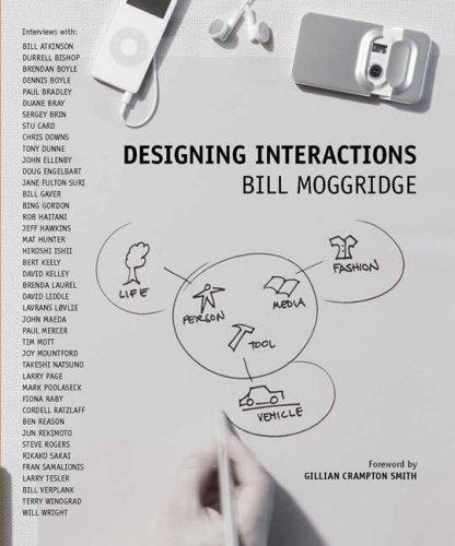 Designing InteractionsBill Moggridge
 The Elements of User ExperienceJesse James Garrett
 Designing with the Mind in MindJeff Johnson